What are the latest trends in kitchen cabinet colors? This question matters because cabinet color shapes the room’s mood, brightness, and perceived size. Current kitchens are moving beyond predictable white, although white remains practical and widely requested. Designers are seeing stronger interest in warm neutrals, muted greens, soft blues, natural wood, and deep charcoal. These shades feel welcoming without appearing overly dramatic.
Warm greige cabinets can soften cool stone countertops. Mushroom, taupe, and sand tones also work well with brushed brass hardware. Muted sage and olive bring an organic feeling, especially beside oak flooring or handmade tile. Navy and smoky blue remain useful for islands, where darker color adds visual weight. Natural walnut and white oak are gaining attention because their grain introduces texture without loud contrast. Very dark finishes can look refined, but they may require more lighting and careful maintenance.
Trends are not universal. A color that looks calm in a showroom may appear green under kitchen LEDs. That mistake is common. Paint samples should be viewed beside countertops, flooring, and appliances throughout the day. Reliable recommendations should consider cabinet material, room orientation, cleaning habits, and long-term preferences. Designers often suggest testing large samples before ordering, rather than trusting a small brochure chip.
Some predictions may age poorly. That is worth admitting. The best cabinet color usually balances current style with the homeowner’s daily experience. A fashionable shade should still feel comfortable during breakfast, evening cooking, and years of ordinary use. This guide examines emerging colors, practical combinations, and the design reasoning behind them.
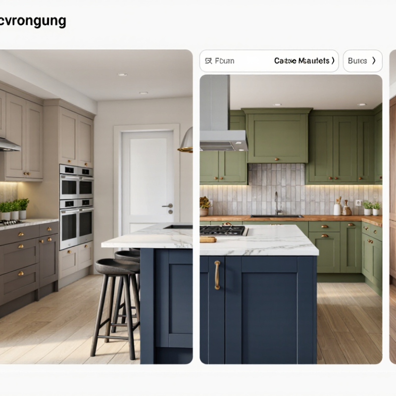
Defining the latest trends in kitchen cabinet colors means looking beyond a shade that photographs well. Houzz’s 2024 U.S. Kitchen Trends Study found that 41% of renovating homeowners chose white cabinets. About one in four chose wood tones. That shift matters. White remains familiar, while natural oak and walnut bring visible grain and warmth. The National Kitchen & Bath Association’s 2024 Kitchen Trends Report also identifies natural materials and nature-inspired colors as ongoing influences. Muted greens and deep blues fit that direction without making every cabinet a statement.
A trend is useful only when it works in the actual room. Check samples beside your countertop and flooring, then view them in morning and evening light. Pale oak can look washed out in a bright, white kitchen; a deep green may feel nearly black in a shaded one. Matte finishes soften glare, but can show fingerprints or scuffs differently from glossy surfaces. There is no single winning color. Survey results describe preferences, not a rule for every home, and color choices can be hard to reverse. I would pause before treating a popular shade as a timeless one.
Neutral and earth-toned kitchen cabinets are gaining attention as homeowners seek rooms that feel calm, warm, and easier to live with. Houzz’s 2024 U.S. Kitchen Trends Study reports that white remains a leading cabinet choice, while natural wood continues to attract strong interest. This balance shows a practical shift: homeowners still value brightness, but many now want more texture and visual warmth.
The National Kitchen and Bath Association’s 2024 Kitchen Trends Report highlights growing interest in nature-inspired colors, including soft greens, muted blues, warm beige, and earthy brown. These shades work well with limestone backsplashes, brushed metal hardware, and oak flooring. A clay-colored island can also create a grounded focal point without overwhelming a small kitchen. In real homes, however, color samples often look different beside windows, countertops, and evening lighting. A pale green may appear calm online but turn gray under cool LEDs.
I recommend testing large sample boards for several days. Small swatches are misleading. Matte finishes can soften strong colors, while textured wood adds depth to simple layouts.
Still, trend reports should guide decisions, not control them. A popular mushroom shade may feel timeless to one household and dull to another. Personal maintenance habits matter, too; very light cabinets reveal cooking marks quickly, while dark finishes can show dust. Houzz and NKBA findings offer useful direction, but careful observation remains more reliable than a single color chart.
Bold kitchen cabinets make a clear statement, especially in smaller areas like an island or pantry wall. Deep forest green, muted terracotta, and dusty blue can add character without overwhelming every surface. Check samples in morning and evening light; a color that looks calm at noon may feel surprisingly intense after sunset. Matte finishes soften saturated shades, while satin finishes reflect more light and show fingerprints more readily.
Dark cabinets, such as charcoal or espresso, create depth and pair well with pale stone, warm timber, or brushed metal details. They can make a low-light kitchen feel heavier, though. Two-tone cabinets offer a middle path: try a darker island with lighter perimeter cupboards, or use one shade below and another above. Keep undertones compatible, or the contrast may feel accidental. Small samples can be misleading.
Tips: Place large color samples beside your countertop and flooring. View them in daylight and under your usual evening lights. Test the arrangement before ordering; it is easy to misjudge a color from a tiny chip.
Cabinet color works best when it suits both the kitchen’s style and its natural light. In a compact kitchen, pale cabinets can reflect daylight and make narrow walkways feel less enclosed. Warm white, soft greige, and light oak pair easily with simple, modern finishes. But all-white rooms can feel flat. Add contrast with a timber shelf, textured backsplash, or darker handles.
Larger kitchens can carry deeper colors, such as forest green or muted navy, especially on an island or lower cabinets. For a traditional kitchen, creamy neutrals and natural wood preserve a welcoming feel; in a contemporary space, restrained two-tone cabinets can add definition without visual clutter. Houzz’s 2024 U.S. Kitchen Trends Study reported that white remained the leading cabinet color, chosen by about 40% of renovating homeowners. That figure reflects surveyed projects, not a rule for every home. Measure light at different times of day before committing; a color that looks calm at noon may appear dull by evening.
Tip: Test large samples beside your countertop and flooring. Check them in morning and evening light. Small step, big difference. A finish can also look different across a broad cabinet run, so review a sample on more than one wall before ordering.
Warm white and light oak reflect more light, which can help a compact kitchen feel brighter. Sage, navy, and charcoal offer deeper contrast that can suit larger rooms or kitchens with plenty of natural light. Values show the relative luminance of representative sRGB color samples, calculated using the standard sRGB luminance formula; they are not survey results or market-share figures. Test samples in your own lighting before choosing a finish.
Color longevity is less about chasing a “timeless” shade than choosing a finish that stands up to daily use. Houzz’s 2024 U.S. Kitchen Trends Study found that white remained the most common cabinet color, selected by 40% of renovating homeowners; wood tones followed at 24%. Those figures suggest enduring appeal, not guaranteed performance. Bright white doors can reveal oily fingerprints beside a range, while mid-tone oak may soften the look of small scuffs. That matters.
For durability, assess the coating and edges, not color alone. The Kitchen Cabinet Manufacturers Association’s A161.1 performance standard evaluates finishes against common household substances and tests moving components through repeated cycles. Ask whether the proposed finish meets that standard. Matte surfaces reduce glare but can hold grease near pulls; glossy doors wipe clean but may show fine scratches. A well-applied, factory-cured coating can suit a busy kitchen, though preparation and care still affect its life. Test a full-size sample near your window and cooktop. Live with it for a week. Even that trial has limits: evening bulbs shift undertones, and cleaning habits vary.
White remains popular, while natural oak and walnut add warmth through visible wood grain. Muted greens and deep blues also reflect interest in nature-inspired colors.
Place a large sample beside your countertop and flooring. Check it in morning daylight and under your usual evening lights.
Charcoal and espresso can create depth, but may make a low-light room feel heavier. Try them on an island or lower cabinets before using them throughout.
Use forest green, dusty blue, or muted terracotta on an island or pantry wall. A small area adds character without covering every surface.
Pair a darker island or lower cupboards with lighter perimeter or upper cabinets. Check that both shades have compatible undertones; otherwise, the contrast may feel accidental.
Warm white, soft greige, and light oak can reflect daylight and make narrow walkways feel less enclosed. All-white rooms may still feel flat.
Matte finishes soften glare, but fingerprints and scuffs can show. Satin reflects more light and may reveal fingerprints more readily.
Treat them as a snapshot, not a rule. Surveyed preferences cannot show how a shade will look in your kitchen.
A broad cabinet run can look different from a small sample. Check the color across multiple areas; tiny chips can mislead.
What are the latest trends in kitchen cabinet colors? Today’s leading choices combine natural warmth, practical versatility, and personal expression. Soft neutrals such as warm white, beige, greige, and light gray continue to create bright, welcoming kitchens, while earthy shades like sage green, muted blue, clay, and wood-inspired tones add depth without feeling overwhelming. Bold colors, including deep green, navy, charcoal, and black, are increasingly used to create dramatic focal points, especially on islands or lower cabinets. Two-tone designs also remain popular because they balance contrast with visual interest.
The best cabinet color depends on the kitchen’s style, size, lighting, and layout. Light shades can make compact kitchens appear more spacious, while darker colors often suit larger or well-lit rooms. Modern, farmhouse, transitional, and minimalist kitchens can each benefit from carefully selected color combinations. For lasting appeal, homeowners should consider durable finishes that resist moisture, stains, fading, and everyday wear. A timeless color paired with a reliable finish can preserve both the kitchen’s appearance and its functional value for many years.